Kapture
Case Study - UI / UX Responsive Design

Kapture
Kapture is a social network for photographers, the main goal of this project is to show the sign-up process for the social network.
April 2022 - May 2022
My Role and responsibilities
My name is John Linsangan and I am a UX designer in charge of designing the Kapture responsive website. My responsibilities includes the following: conduct research and interviews. Create paper, digital wireframes. Create low and high fidelity prototypes. Conduct usability studies and ensuring accessibility and iterations of the design.
The Problem
Some users don’t see the benefits of using a social network for photographers, or don’t have the patience to fill up a bunch of forms.
The Solution
To create a successful onboarding for the potential user and make the sign-up process as simple as possible.
Pain Points
Time
Most social networks requires to fill up a bunch of forms that takes too long.
Privacy
Most social networks are not transparent about user privacy and ask a lot of personal information.
Time
Most websites only allows you to sign-up one way.
Research
User Research: Summary
I conducted a series of interviews and created empathy maps to help me understand what type of users I am designing for. I have learned during my research that one of the primary user group are professional photographers looking to expand their network through the social network.
This primary user group shares the same common frustration of how most social networks requires a lot of information just to join, and in most cases he or she does not have the time to fill up a bunch of forms that is very time consuming. Despite sharing the same frustration, the main user group loved the idea of being able to network themselves within a community and potentially earn them a gig or a job.
Persona
User: Jackson
Jackson is a professional photographer who needs to sign-up to a social network for photographers because he wants to share his photography easily and fast.

Ideation
Sitemap
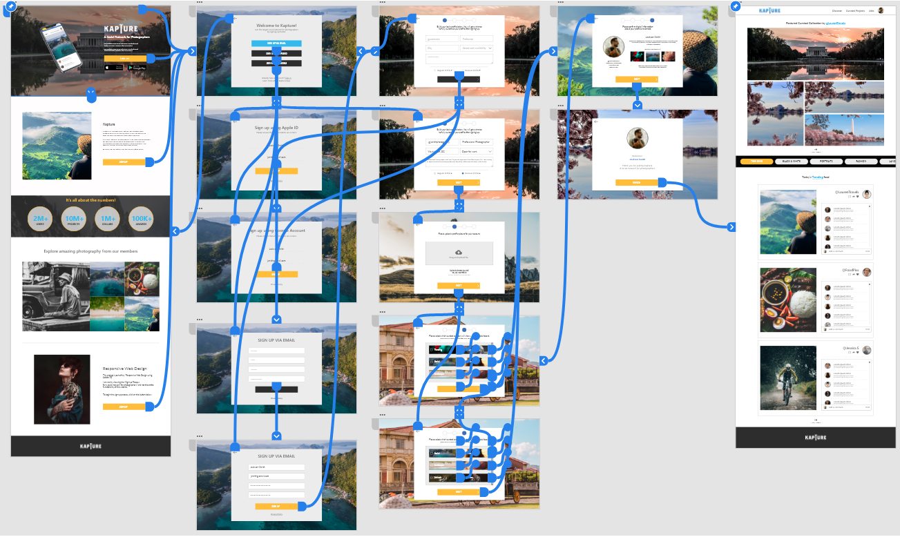
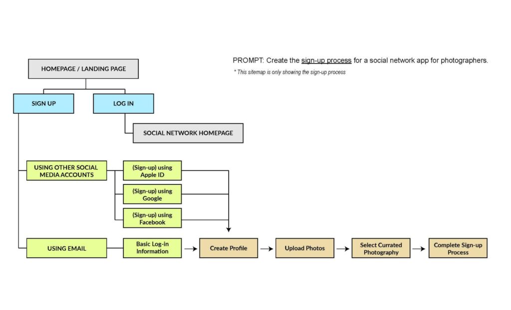
The landing page is mainly towards either signing-up or logging-in for this purpose I want to show the process of signing-up to the social network.
Usability Study Parameters
Study Type
Unmoderated usability study
Location
United States, remote
Participants
5 Participants
Length
20-30 Minutes
Usability Study Findings
Landing Page
Users find that having options / reminder about signing up is very helpful
Navigation
Users wanted a way to go back to the previous form during the sign-up process
Wireframe
Paper Wireframe
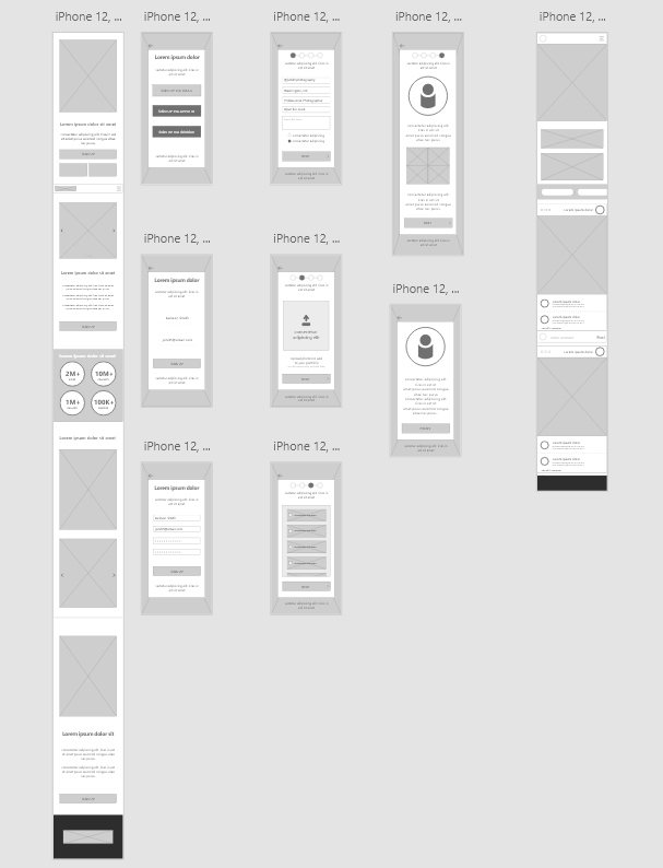
For the paper wireframes I wanted it to focus more on the signing-up process. Also showing how simple the process is.


Low-Fidelity Wireframe & Protoype
For the paper wireframes I wanted it to focus more on the signing-up process. Also showing how simple the process is.
High-Fidelity Wireframe
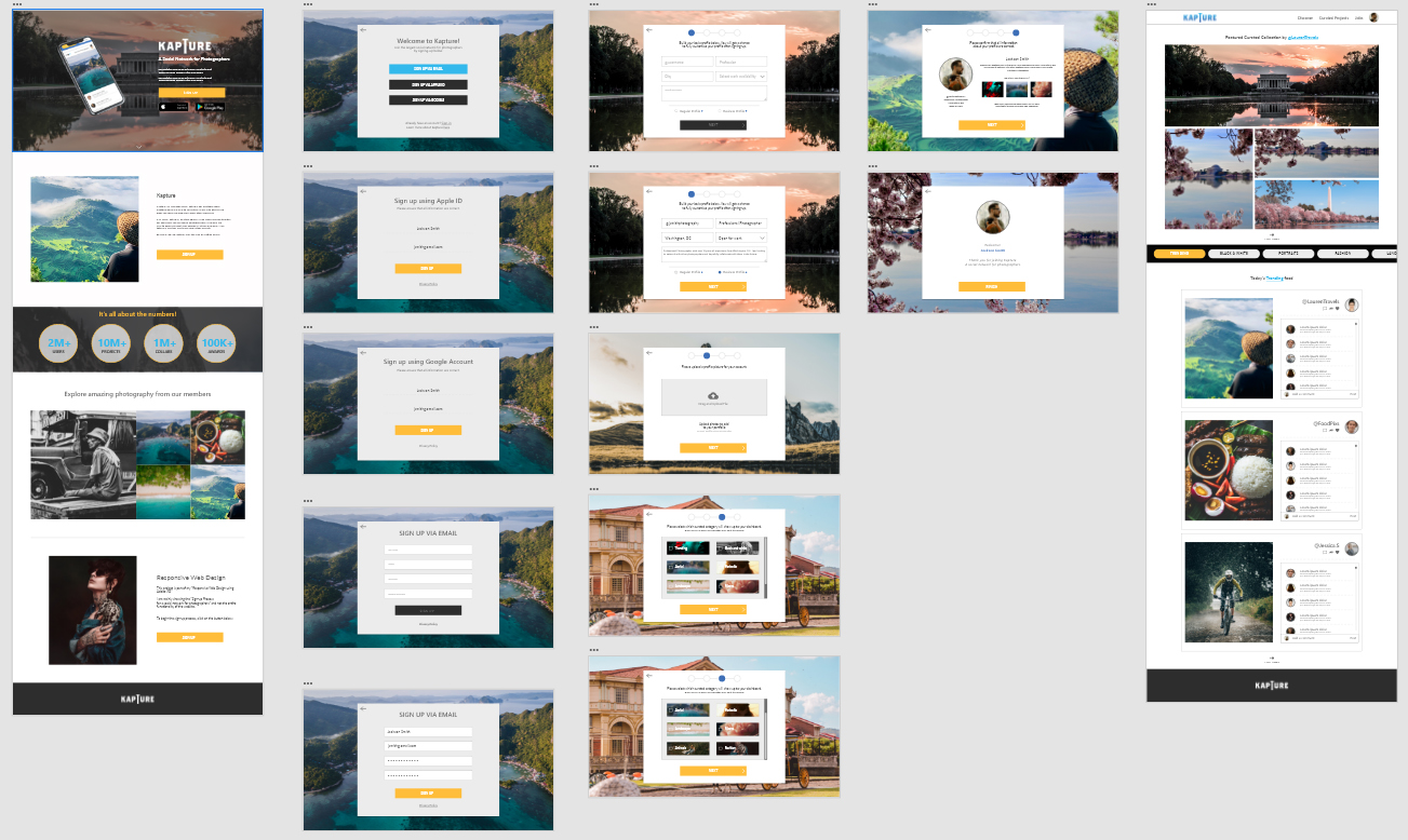
The sign-up process is much easier to understand and follow by keeping the same layout all throughout and making it simple for user to understand and can freely go back and forth.
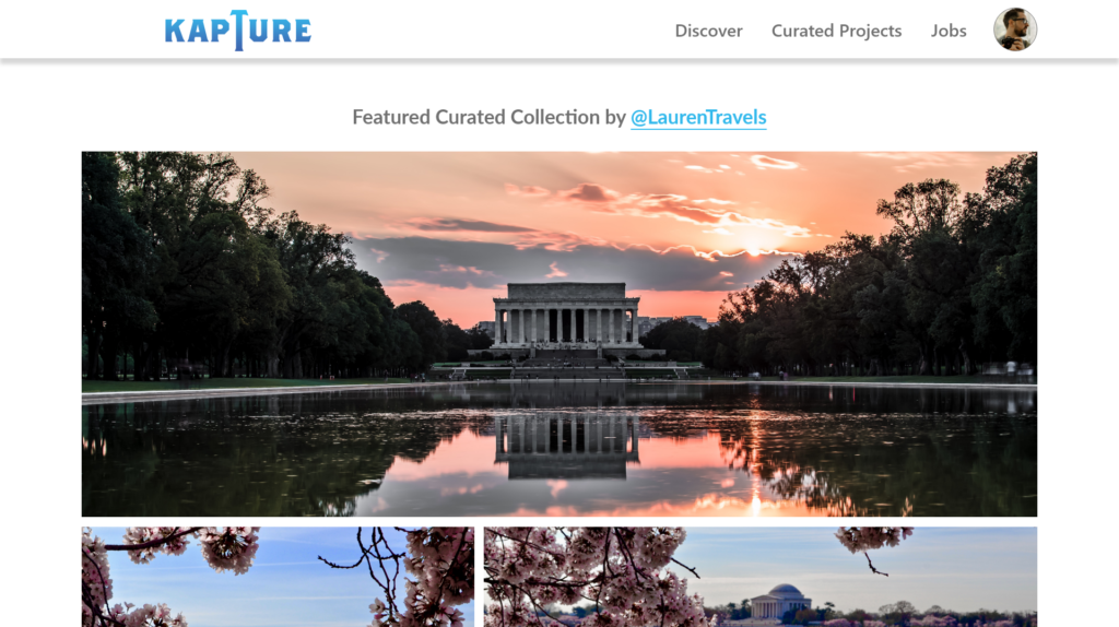
The high-fidelity prototype followed the same user flow as the original lo-fi prototype, but I added a few changes after the usability study. Some parts of the form starts as blank and when click it will fill-up the form. I also added fun interactivity to show what the final look of the website will be.
Responsive Mobile Design
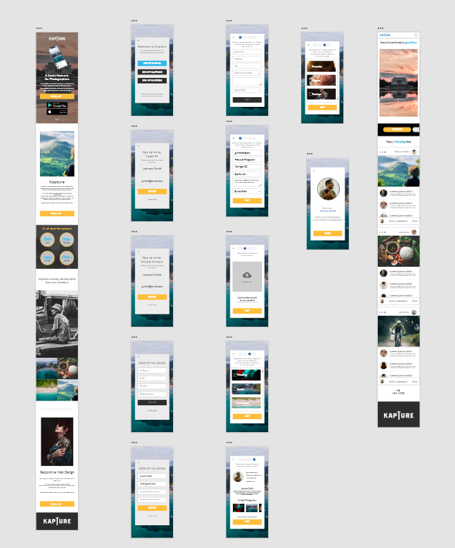
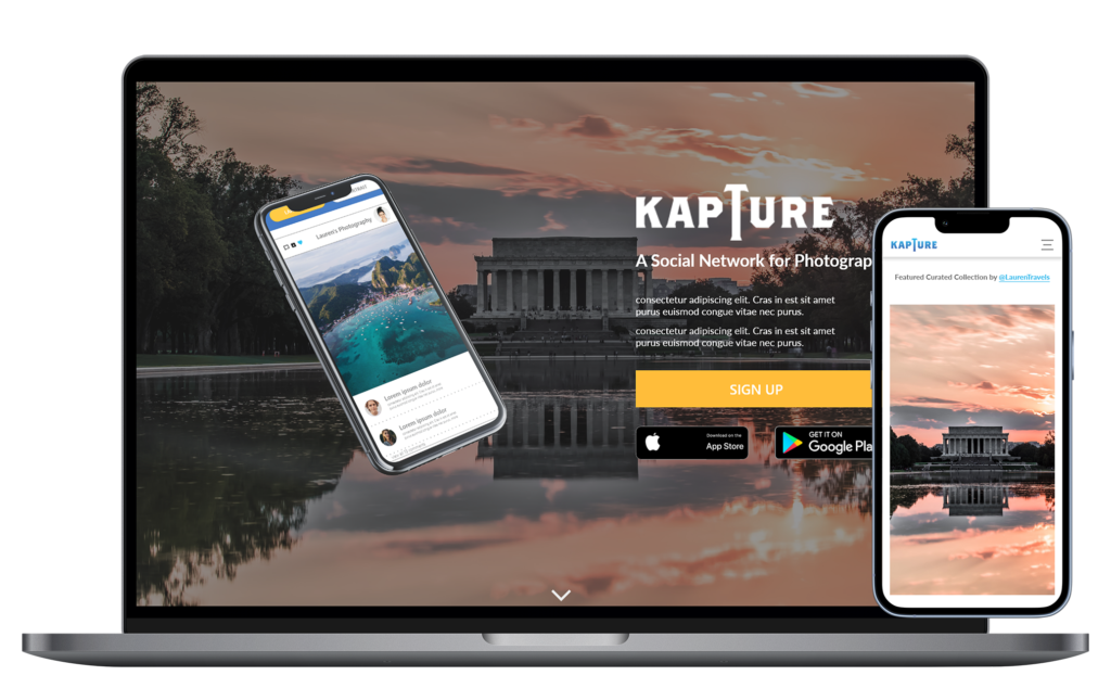
With the desktop design complete I then created a responsive mobile version of the website. The look and feel of the desktop version and the mobile version are not too far apart with some elements have to be moved around, but still showing the same features as the desktop version.
Finish Product



Take-Aways
Impact
The primary users shared the ease of signing up to the social network. Because of that the likelihood of potential users signing up to the social network is much higher.
What I learned
I learned that users prefer to have more than one option in completing a task. Some prefer to be detailed and some just want to get through the process quickly.
*This case study is part of my entry to Google Career: UX Certification. KAPTURE is a made up product.


